Data visualization (data viz to its friends) is all about conveying the most information with the least amount of effort. Good data viz expresses a point near-instantaneously, so it’s no surprise that businesses need lots of it. Well-designed charts help you make your point fast and memorably.
The Power of Good Data Viz
Do you need to make a complicated point quickly? Do you need to rapidly express the result of a data-packed paragraph in a more easily digested format? Data visualization is ideal for both of these situations.
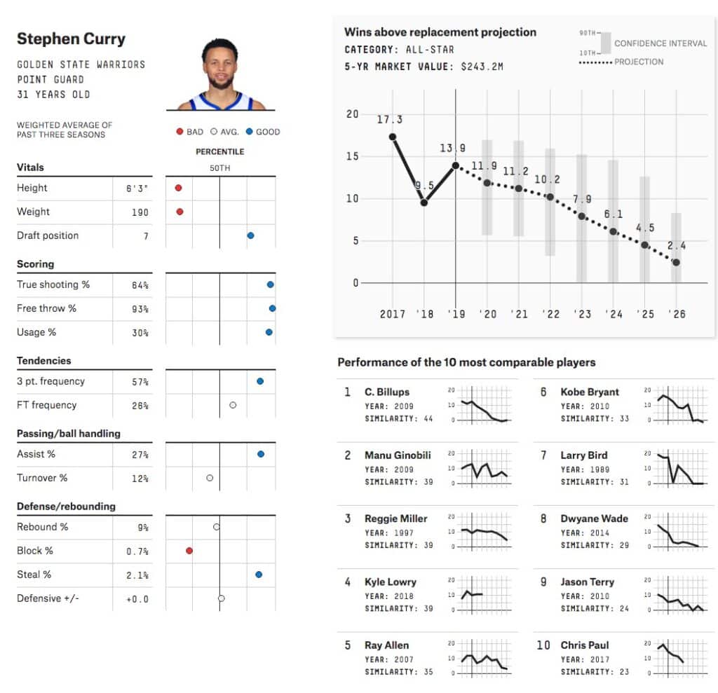
The power of good visuals lies in speed. We can process the content of an image far more rapidly than the contents of a paragraph. In less than two seconds, a good visual will clearly express its message. That’s faster than the time it takes to read a few sentences, let alone understand them. We also tend to agree with the data we process visually versus verbally, which helps engage customers by making your case for you.
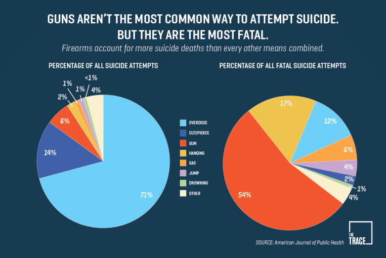
The Pain of Bad Data Viz
If your visualizations seem intended to obscure the unsupported nature of an argument, they can backfire dramatically. This tends to happen when charts are created with hypotheticals instead of actual data. Imaginary guesses about how sales might increase when your product is adopted are worse than useless, and anyone smarter than a raccoon will figure out your game. Not only does it make you look foolish, but it implies a belief that your prospects are too dumb to catch on. That’s obviously a terrible look.
Visualizations are also dangerous when they hide or obscure part of an argument, or express data in a way that’s inaccurate or ineffectual. Bad data viz might seem harmless, but in the wrong circumstances, it can have dire consequences.
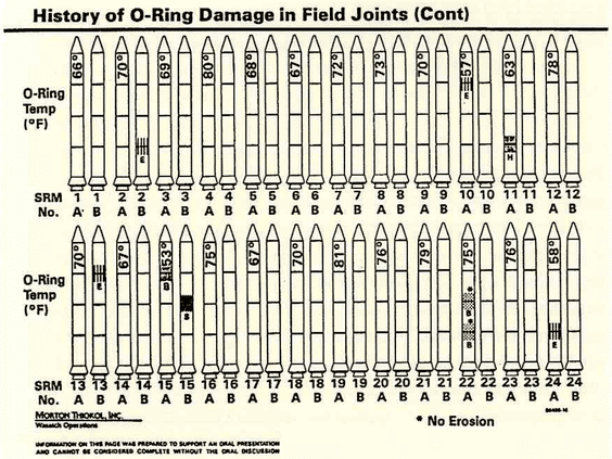
As foremost data viz expert Edward Tufte writes in Visual Explanations: “As analytical graphics, the displays failed to reveal a risk that was in fact present. As presentation graphics, the displays failed to persuade government officials that a cold-weather launch might be dangerous. In designing those displays, the chart makers didn’t quite know what they were doing, and they were doing a lot of it.” Smart people worked hard on this, but their graphics accidentally hid the O-rings’ problems until it was too late.
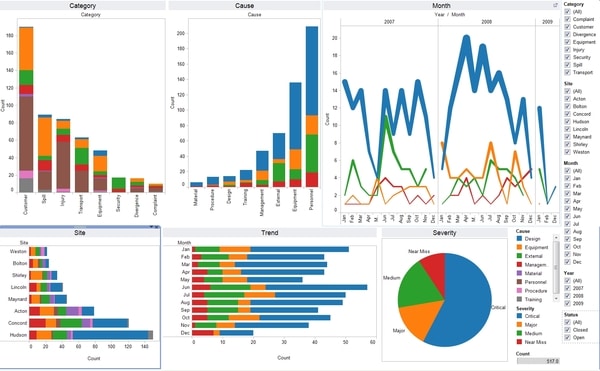
Your charts probably won’t kill people. But if even the smartest folks at NASA could screw up a chart, so can you. Don’t assume that any chart is a good chart. Be confident enough to criticize your own work and make any changes needed to improve comprehension.
Best Practices for Good Data Viz
Do you really need a chart?: Data visualizations and charts should really only be applied when they’re useful. In most cases, this means showing an unexpected relationship or a strong correlation. Unnecessary charts rarely help your case, and they dilute the impact of good charts. Don’t be afraid to limit your visuals. They’ll have a much stronger impact when used sparingly.
Use sensible colors: the single most frustrating, obvious failure in graphic design is a misuse of colors, and not just because they’re ugly. Bad color choices make graphics harder to understand. Lean into natural color relationships: red is bad, green is good, blue is cold, yellow is warm, and so forth. If you are trying to show a good/bad relationship with your data, lean into green and red. If you want to show one indicator changing over time, a monochrome design will let your data take center stage. Use conservative color schemes. Readability should be your highest priority, not looks.
Know your intention before you make a graphic: Don’t jump into a data set cold and hope you can make something of it. Think about the relationship you want to show; only then should you find the data that would be useful to make that point. Use the correct chart type to clearly show the relationship you want to highlight.
Only useful data: Avoid crowding out your good data with junk. If the data doesn’t help make your point, remove it. The fewer data you have on your graphics, the faster they can be read, internalized, and agreed with. But what’s useful? Follow the advice of a great author: the chart is finished not when there’s nothing more you can add, but nothing more you can take away. Small and smart is better than colossal and comprehensive.
Limit visualizations to one data set: Dual-axis visualizations are hard to read. Even real-deal scientists avoid them, and they’re wicked smart. Doubling up on your axes or labels is also a sign of poor design. In most cases of axis multiplication, you’re trying to accomplish too much with one chart. Slim down your goals or create multiple graphics to convey multiple points. For example, five-bar charts displayed on the same slide may be easier to understand than one stacked bar chart.
Avoid words whenever possible: Designers sometimes add explanations to bad charts, hoping to fix their issues. This doesn’t work. The extra text will only slow down viewers, and it’s unlikely to help. Instead of adding explanations, rework your chart to reveal the relationship or take out whatever’s obscuring it.
Look for simple designs: Not only is it easier for you, but it’s also easier for the reader. Designs with a third dimension, excessive shadowing, or other purely aesthetic effects only distract from your story. Not to mention that 3D pie charts haven’t been impressive since Windows 95 was released.
Don’t know where to start? Zoho Writer offers a huge selection of tools for creating data visualizations and business graphics. The in-browser platform has better tools than Google Docs or Office365, with slick creation and publishing tools. Stop cursing at Word every time you move an image three microns to the right and check out Zoho Writer.


