“Early in my career as an engineer, I’d learned that all decisions were objective until the first line of code was written. After that, all decisions were emotional.”
Ben Horowitz, co-founder of Andreessen Horowitz
Mr. Horowitz’s quote parallels the importance of prototyping — changes made in the design phase of a project are much faster and simpler to adjust than changes at the end of the project.
What Is Prototyping?
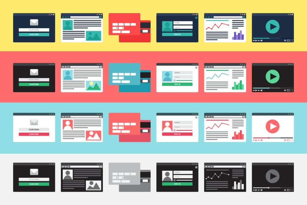
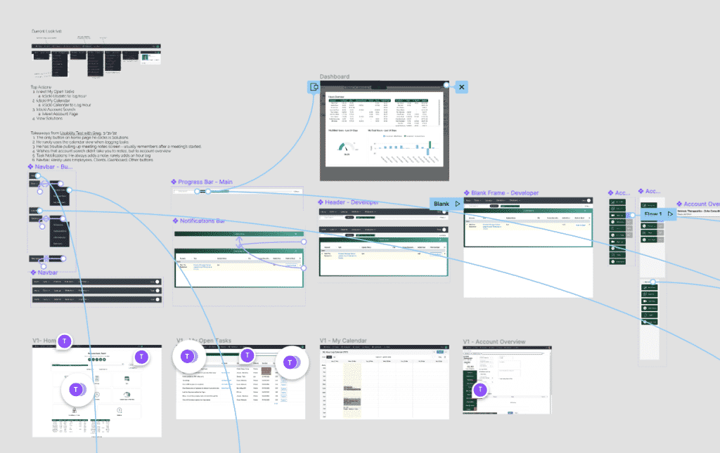
When referring to Prototyping in web or graphic design is a way of using design software (such as Adobe XD or Figma) to create a functional design of a website. When a designer creates a prototype, he or she will seek to make it look as real-looking as possible, using the same button styles, typography, and color schemes that your final website will have. Then, they’ll take it a step further by linking buttons to specific pages to make the prototype feel like a real website. Because it feels real, a prototype is a way to get feedback on the content and design of a website earlier in a project and before development begins. In turn, significant time and money are saved by taking care of changes in the beginning.
First, let’s take a step back. In order to understand prototyping, let’s first explain the entire design process in 8-steps:
1. Understanding Client Needs
A talented designer will be able to translate your business needs into a simple and intuitive user interface that will help your customers accomplish the task you want them to achieve. For example, if you sell dishwashers, your site’s main call to action may be “Buy a Dishwasher”, and your designer will design a website that makes it clear that you want your customers to buy a dishwasher.
2. Wireframes

Think of a wireframe as a digital sketch. Wireframes are a way to use simple shapes to create the basic structure of a new website or app interface design. A wireframe is a way to work out structural challenges before color, typography, and content gets determined.
3. High-Fidelity Designs
After the site’s structure is determined, the next step is to add brand fonts, colors, and images, and focus on specific design elements like button padding, content width, and how things will look when viewed on a mobile device. This is also where a lot of back-and-forth communication will happen between a designer and a client, to solidify the website’s content before development begins.
4. Prototyping

Prototyping is a fast yet often-neglected step in the design workflow. It adds interaction to your website design: Clicking a button will take you to a separate page. Scrolling down will actually scroll down. Thus, it will feel like you are using a real website.
“Testing” a design gives you a chance to find problems with the current user experience and make changes while still in the design phase of the project. For example, maybe a button clicked goes to a page that doesn’t exist, which will help you know that you need to fix that problem before beginning development.
Remember: The main difference between a high-fidelity design and a prototype is a prototype adds interaction.
Benefits of Prototyping:
- Give the client an idea of how the final product will look.
- In the prototyping stage of a project, a client and designer can have a quick feedback loop to make changes to the design.
- Identify problems with the flow of the website
- Here, it’s easy to identify problems with the flow of the website.
- Work out exact colors, element sizing, and font sizing
- Working it out in the design phase helps save time during development.
- Have a blueprint on which to base the developer’s work.
- Time Savings = $$$ Savings
5. Client Approval
After a prototype is finished, your designer will meet with you to get approval on the final designs. After this point, as Ben Horowitz said in the quote above, things get emotional, and changes in development tend to take far longer than changes in design.
6. Handoff to Development
Your designer will hand off their design files as well as technical notes (exact font sizes, button padding, all the images), and your developer will build the pages verbatim.
7. Quality Control
After a developer finishes a page, the page is sent off to quality control to make sure that it looks the same as the original design, and also to make sure it resizes well on tablet and mobile screen sizes. Ideally, quality control shouldn’t be necessary, because a well-developed site should get things right the first time, but this is a project manager’s chance to correct any errors.
8. Handoff to Client and End of Project
This is that dance-in-your-seat moment! You have a custom website that you’re proud of and will start generating revenue for your business.


