Zoho Analytics is a self-serve business intelligence platform for analyzing data and unearthing trends. Analytics can produce actionable intelligence for common questions with a few clicks and minimal setup. Zoho Analytics collects and collates data in a smart, security-conscious way, providing incisive reports for tracking trends and live dashboards for monitoring changes.
Because Zoho is an integrated reporting platform, the techniques below will work excellent for any data you’re working with. You can pull data into Zoho Analytics from common tabular data formats like CSV, XLS, and HTML hosted locally or in the cloud, grab records from your existing database, or push data from any application to the Analytics API.
Import or Connect Data
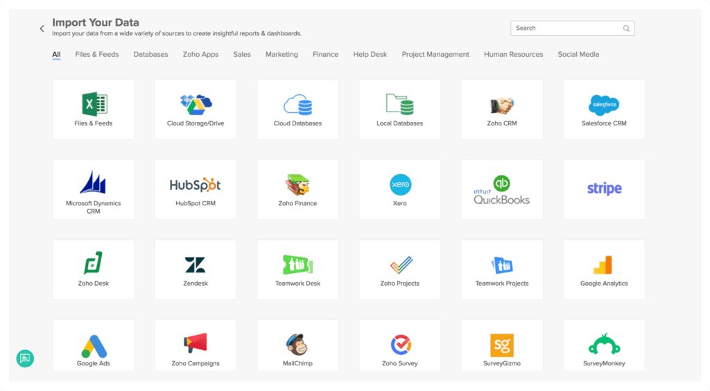
Log into your Zoho Analytics account, then click Import Your Data in the upper right.
You can pull in data from local files, URIs, cloud storage, local and cloud databases, custom apps, and other Zoho applications. To import your data, log into Zoho Analytics, and choose the data location you need to import from. For more detailed instructions on configuring your specific data feeds, check out the Zoho Analytics guide to importing and connecting data sources.

Once your data is connected, Zoho Analytics will automatically create a new Workspace to hold the data. Workspaces store the reports, dashboards, and other analytics you’ll create.
Building Reports
Reports tell you what is up with your analytics. You can set them to auto-generate at a predictable interval for repeating tasks like monthly reports and weekly roundtables, or throw together ad-hoc reports as needed. Smart businesses might even assemble some report “templates” that can be generated as needed alone or combined to answer typical questions in seconds.

Reports are made up of drag-and-drop options like charts, pivot tables, summary views, and tabular views. These charts can be connected back to your data sources, as imported or synced in the previous step.
- Chart view: graphical data representations using bar charts, pie charts, line graphs, and more.
- Pivot view: a tabular view that dynamically reorganizes information in a tabular format. Aggregates and filters data into summarized columns and rows.
- Summary view: shows data grouped into categories and totaled, or summarized. Unlike Pivot views, these cannot be dynamically reorganized or “pivoted,” but only show the data as you organize it.
- Tabular view: a list of data values in a column-based format, like a spreadsheet.
Creating New Reports
- Open the Workspace you’d like to create a report in. If you want to make a chart for a specific data set, you can also navigate to that data feed, then click the + to produce a new view with that data set.
- Click +Create at the upper left.
- Choose the type of Report you want to create (Chart View, Pivot View, summary view, or tabular view).
- In the Chart Designer, drag column titles from the left sidebar into the appropriate fields on your chart. This will connect that data stream to that part of the chart.
- To filter data, click the Filters tab. Drag a column in to select which of its attributes to filter on. You can also define custom user filters.
- Customize the appearance of the view under the Themes button at the top of the data shelf.
The same basic process can be followed for all views, using the same drag-and-drop interface.
Creating Dashboards

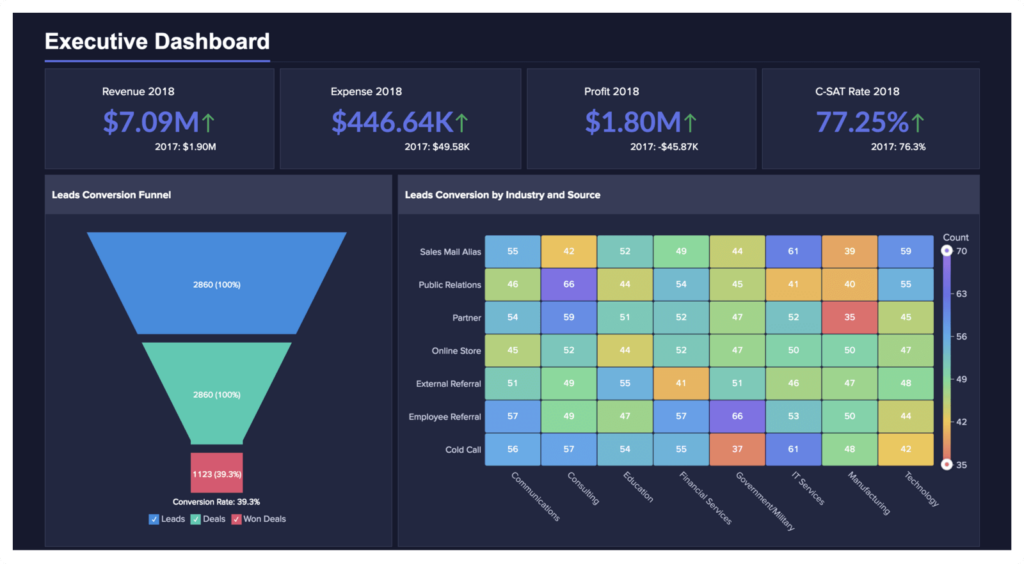
With Reports, you’ll get the most up-to-date data at the time of the report’s generation. If you need up-to-the-minute data, constantly refreshed, you’ll want a Dashboard. From a conceptual perspective, dashboards are simply live-updated reports. In fact, they show the reports you’ve already made, but are updated as new data arrives. Once you’ve created some reports or data views, you can insert those elements into your live-updated dashboard.
- Navigate to the Workspace you’d like to create a Dashboard for.
- Click +Create at the upper left.
- Choose Create New Report > Dashboard.
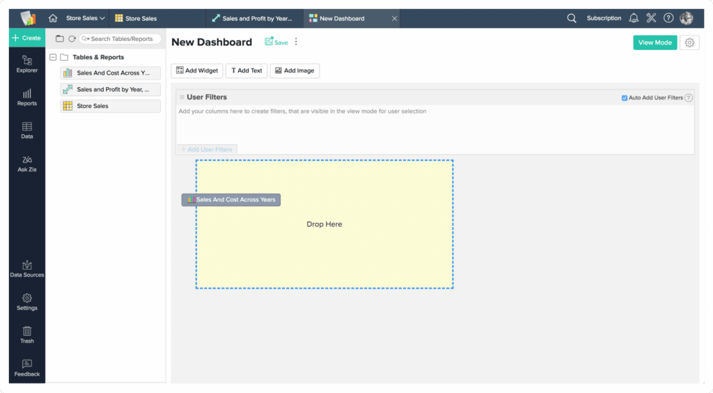
- In the Dashboard Builder, drag and drop reports from the left panel to the dashboard area. You can add any number of reports to the dashboard.
- Add widgets with the Add Widget button to emphasize critical KPIs. Widgets call out critical KPIs from your data set for improved visibility. Widget styling can be customized in the widget’s Settings tab.
- Reorganize reports and widgets as displayed in the dashboard’s grid format by dragging and dropping.
- Insert static style elements like images with Add Image, or text with Add Text. You can also insert plain HTML using the Add Text feature.
- Add User Filters at the top of the dashboard preview to show only the most important data.
- Click on the Themes button in the toolbar to style your dashboard with professional pre-built themes or custom designs to match your branding.
Publishing and Sharing
Once you’ve completed your masterpiece, you’ll need to “publish” it. You can generate public URLs for mass communications, private URLs for private reports without a login, or authenticated access through a secured Zoho login page for approved access only.
- Log in to Zoho Analytics and navigate to the appropriate Workspace.
- Click Share > URL/Permalink.
- Choose which type of login you’d like to create.
- Set display and access options as requested, based on the type of sharing options you selected.
- Copy the provided link from the text box when finished.


